Laura
Green
in Glasgow
Designer
UX / UI
based
About
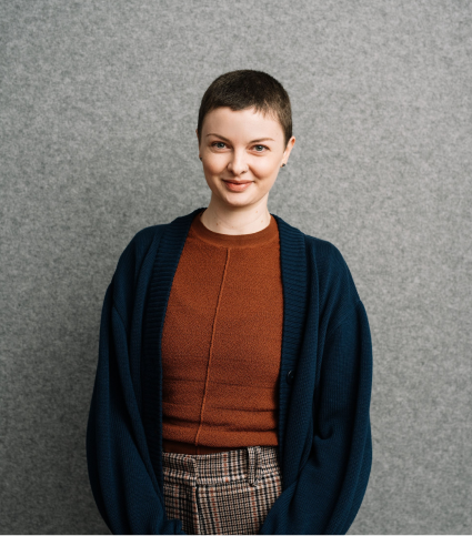
A photo of Laura
I am a UX / UI Designer with a background in Interior Design. I have a strong focus on human centered design and am able to work with users to achieve functional design outcomes. I have an understanding of the iterative design process and am looking for opportunities to achieve client-driven outcomes in a digital space.
I thrive on problem-solving and the details.
Selected
projects
Book Borrowing App
A UX Design project completed as part of a UX Design course. Working through the design process based on a hunch.
Defining the Problem
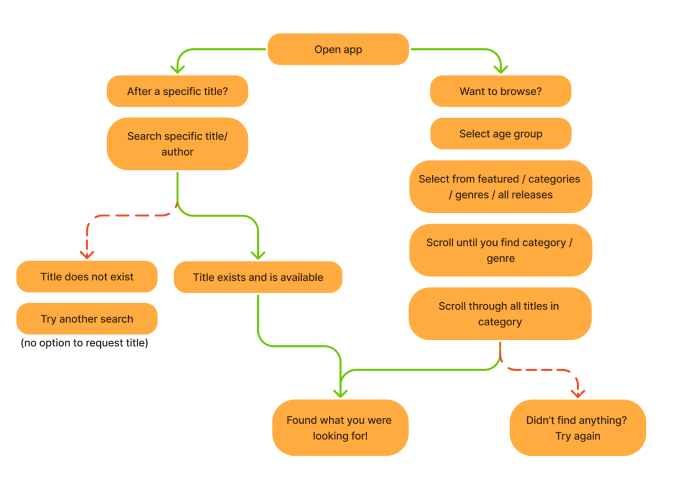
Based on my hunch, I mapped out the user flows both in diagram and through screenshots, to get a clear understanding of the process users currently take to search and browse for titles.
Hunch - Users might find it difficult to find a book because there is no way to sort or filter titles.
User Research
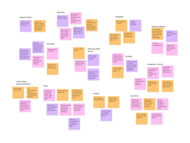
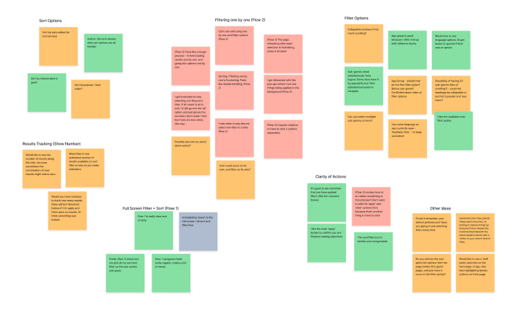
After carrying out some desktop research to confirm my hunch - scrolling through the app reviews made quick work of this - I set about interviewing users who fit within the personas I had created, and who were familiar with the app. I took this information from the users and through grouping the information in an affinity map, found some strong insights.
Ideation
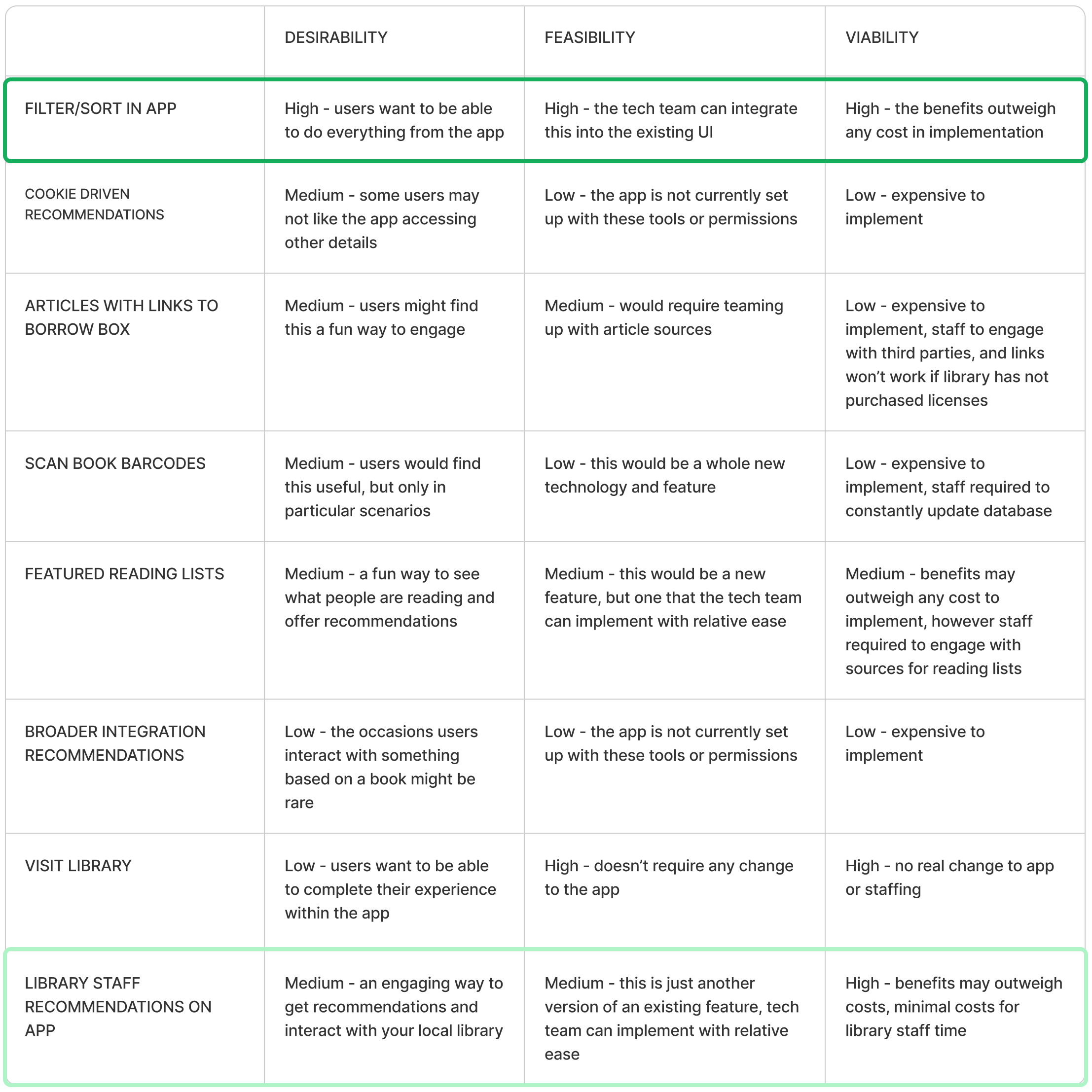
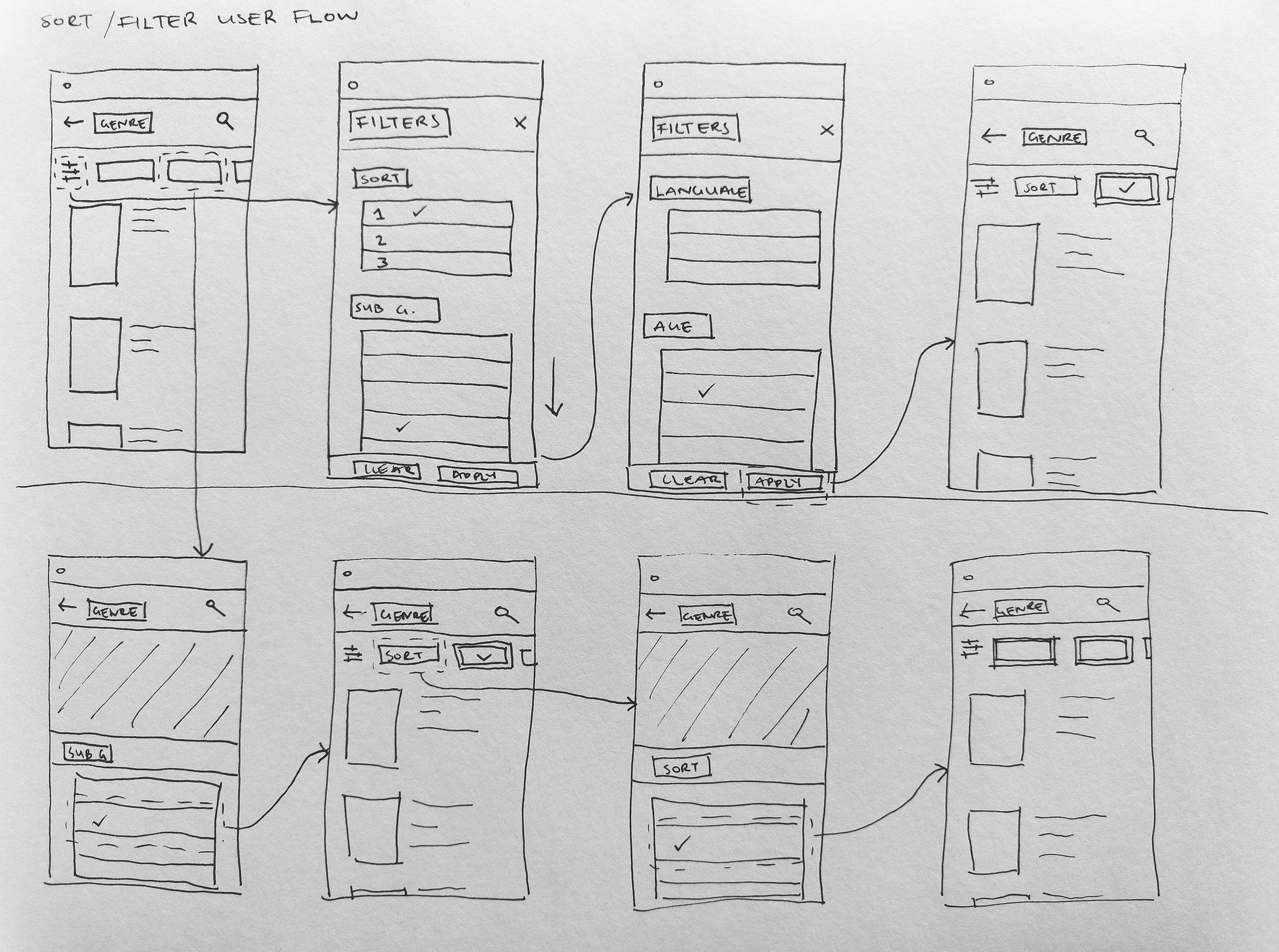
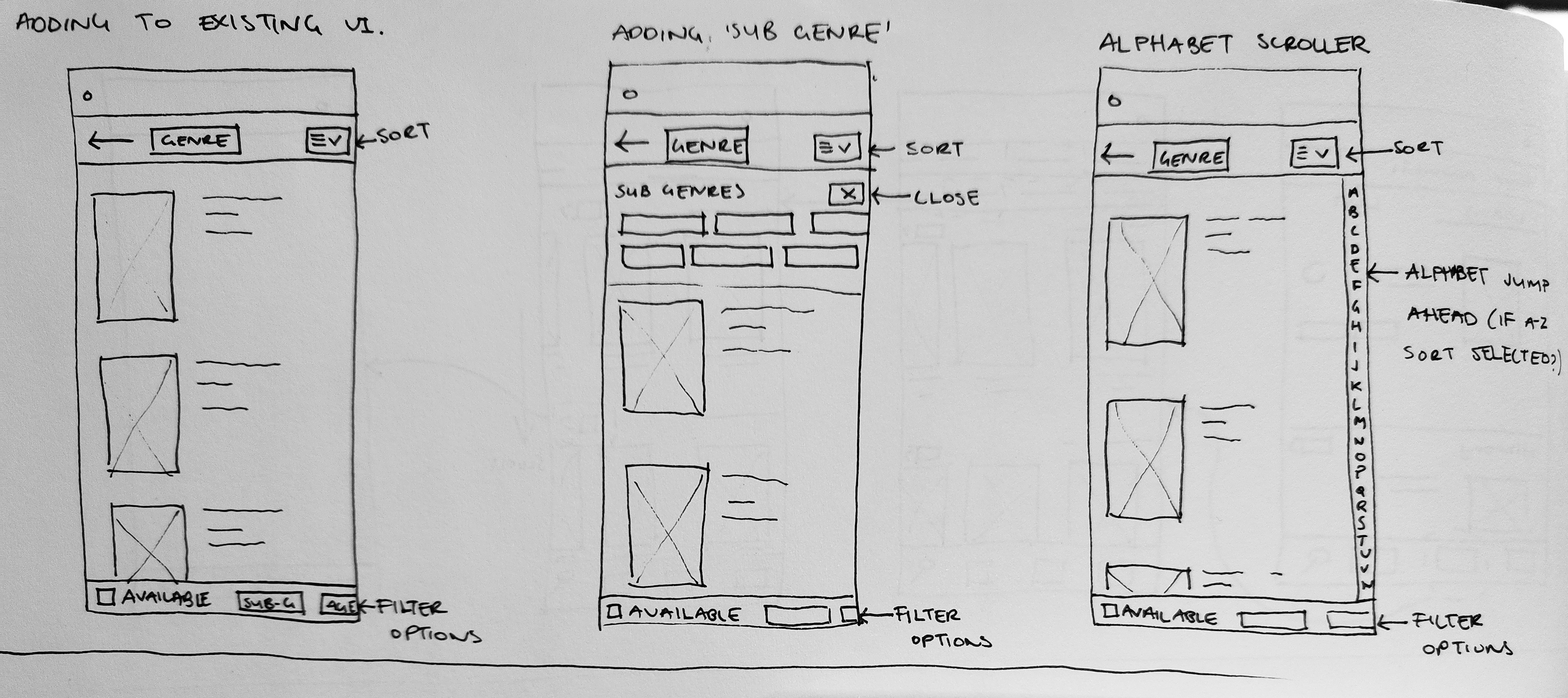
With my insights and recommendations, I got to sketching up some ideas. Initially starting with a solo ‘Crazy 8’s’ exercise, I then ran the ideas through a prioritisation exercise - desirability, feasibility, viability - to see which idea made the most sense to progress with. The result took me back to another of the original ideas, so I did some further sketching focusing on that.
Concept Design
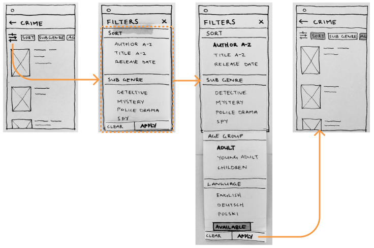
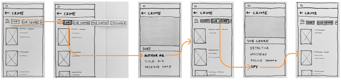
I created low-fidelity paper prototypes for the two user flows; two different ways of using the proposed filter and sort options. These were taken into user testing.
Usability Testing & Iteration
I ran the information gleaned from the user testing through a Rose, Bud, Thorn process to group the information. All of the users had similar issues and comments on the lo-fi prototype, which made for useful insights to iterate the design.
Medium Fidelity Prototype
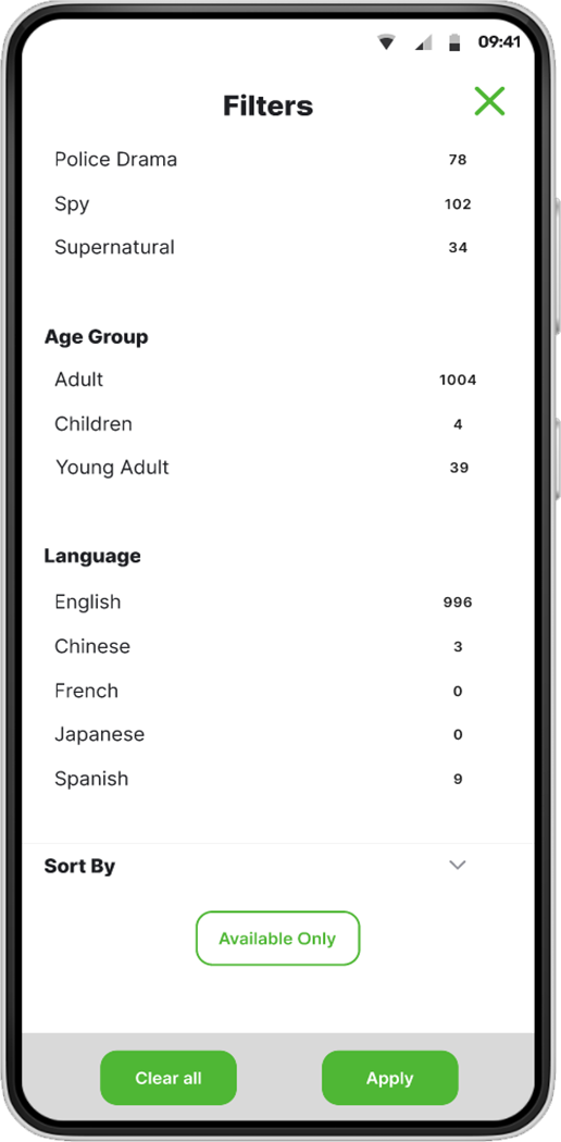
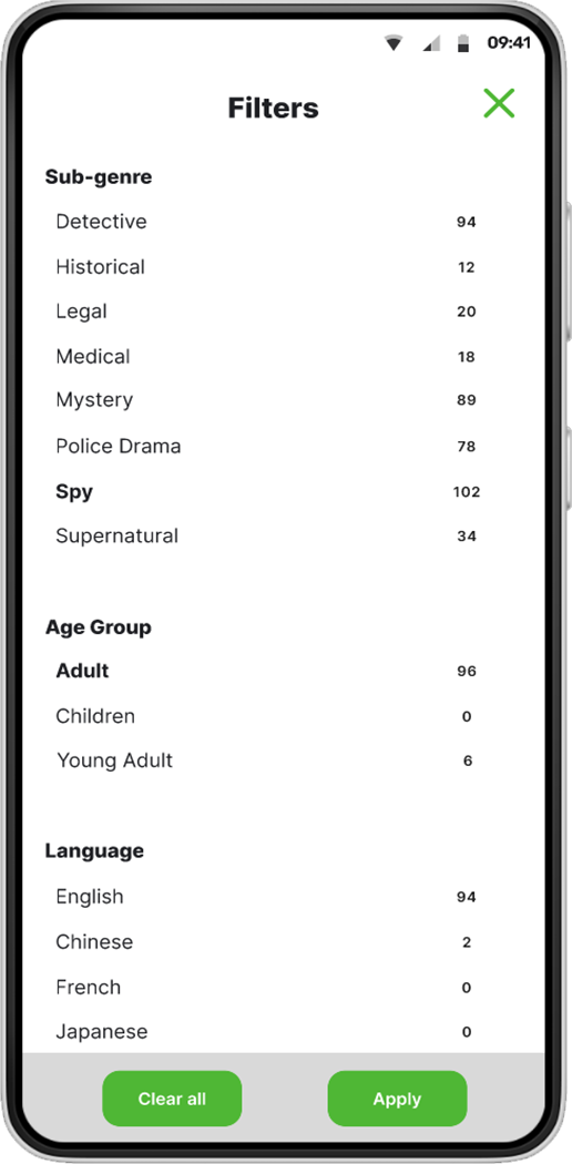
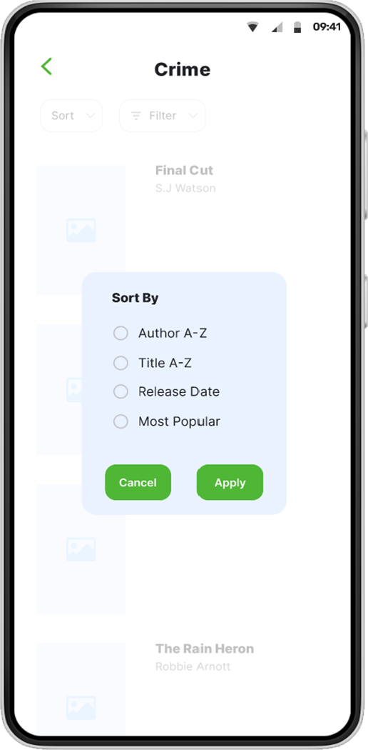
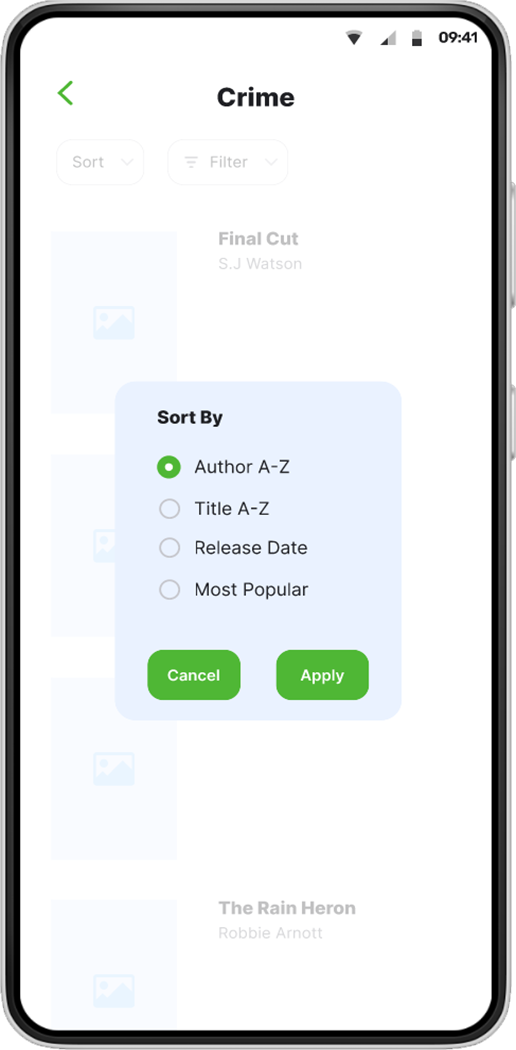
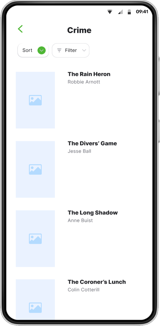
Taking the insights from the user testing, and re-visiting how some of the apps I had looked at during my desktop research handle sort and filter options, I iterated the design and created a medium-fidelity prototype in Figma.
Joey Bank
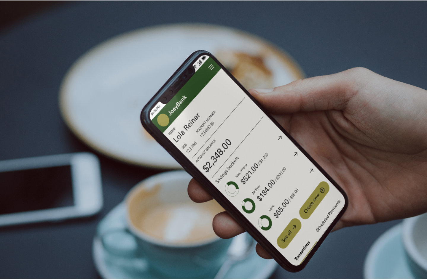
A UI project completed as part of a UI Design course. Working to create a minimum viable product based on a client brief and provided lo-fi wireframes.
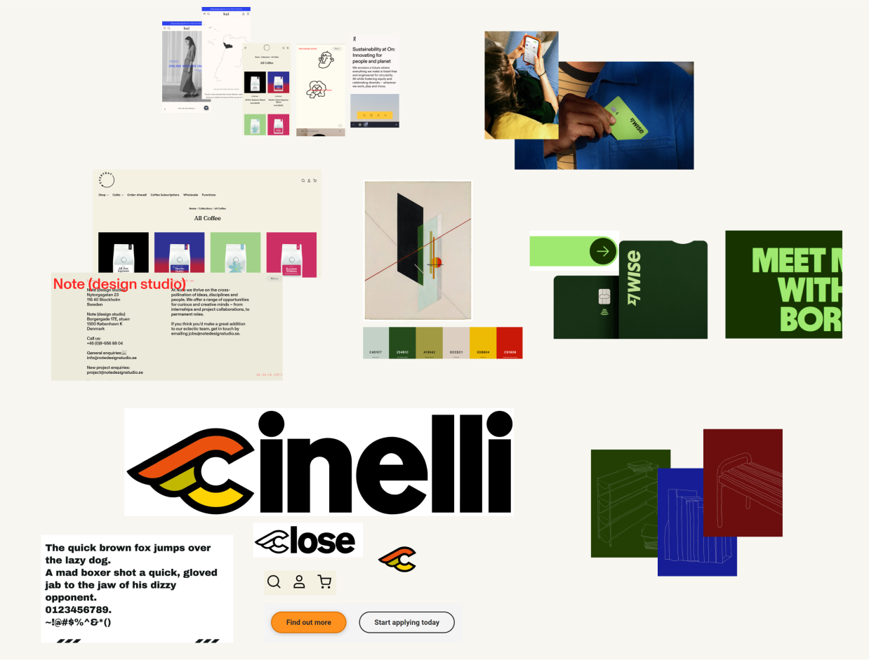
Mood Board
I wanted to create a feeling of confidence, calmness and control, based on the user personas that were provided to me. The style to achieve this is minimal, simple, clean and bold, with a tone of familiarity and confidence, that feels welcoming and rational. I was drawn to the Bauhaus design movement as a source of inspiration, due to it’s functional approach, which resonated with the style and tone.
UI Flow
I mapped out a UI flow to show all the different processes a user will need to carry out on the banking site. This also considers different states for each page.
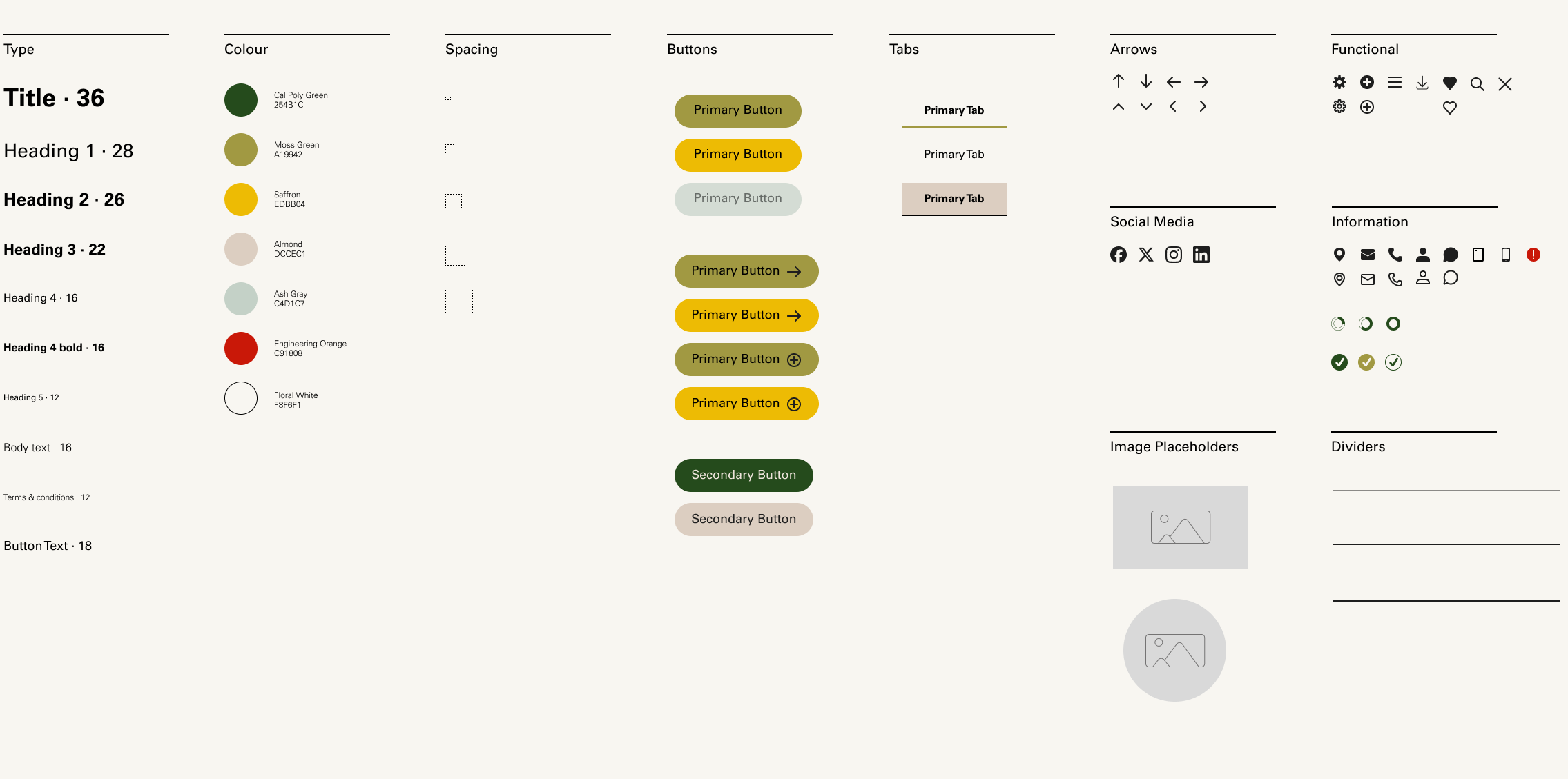
Component Library
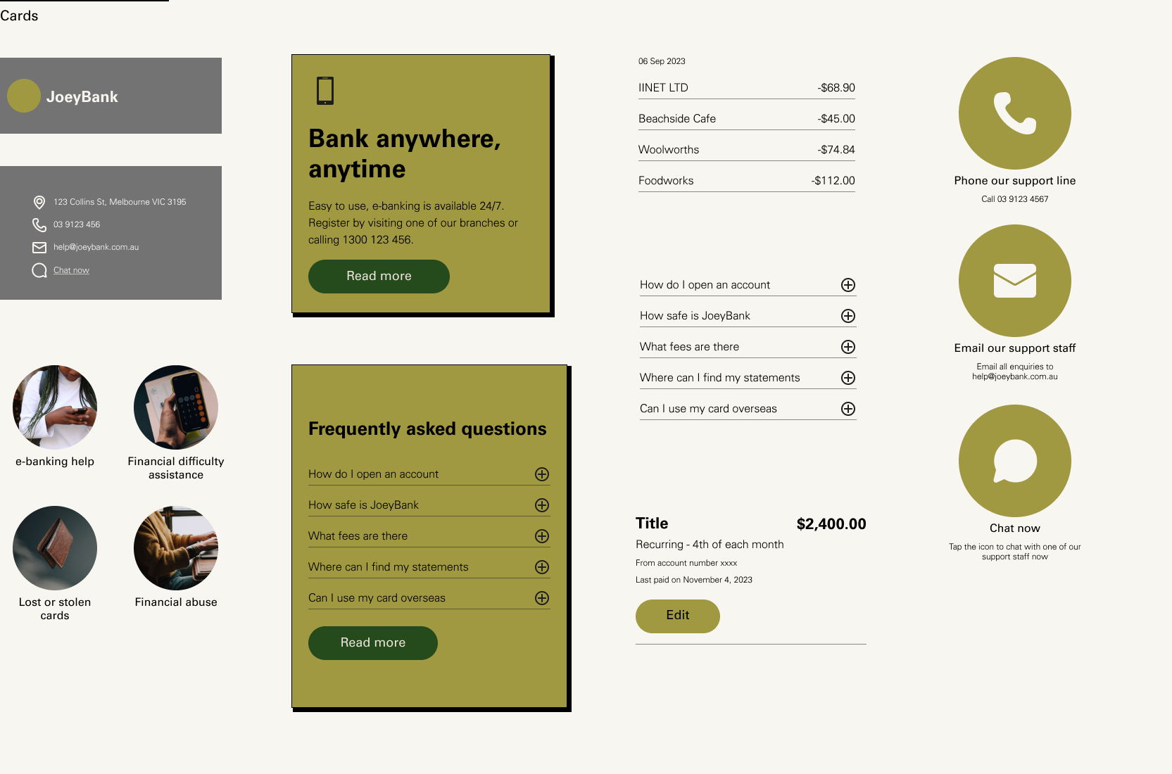
Style elements such as type, colour and spacing are all set out in the component library, as well as a custom icon set, buttons, tabs, dividers, image placeholders and cards.
Iteration
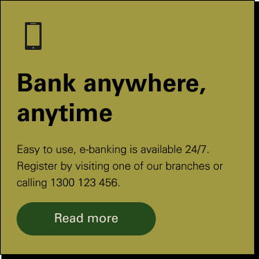
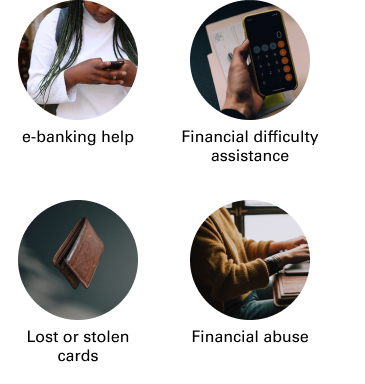
Firstly, looking at overall design iterations, with different fonts, buttons, tabs, colours and layouts. Then, focusing on how one page design changed through the design process, firstly changing to a more minimal design, in line with the initial moodboard and style direction, then changing again to have consistent button styles and spacing to the other pages. Even at a component level, you can see the ‘Bank Anywhere’ card changed to be stronger, more confident element, whereas the help card was brought inline with the clean, simple design elements.
Usability Testing
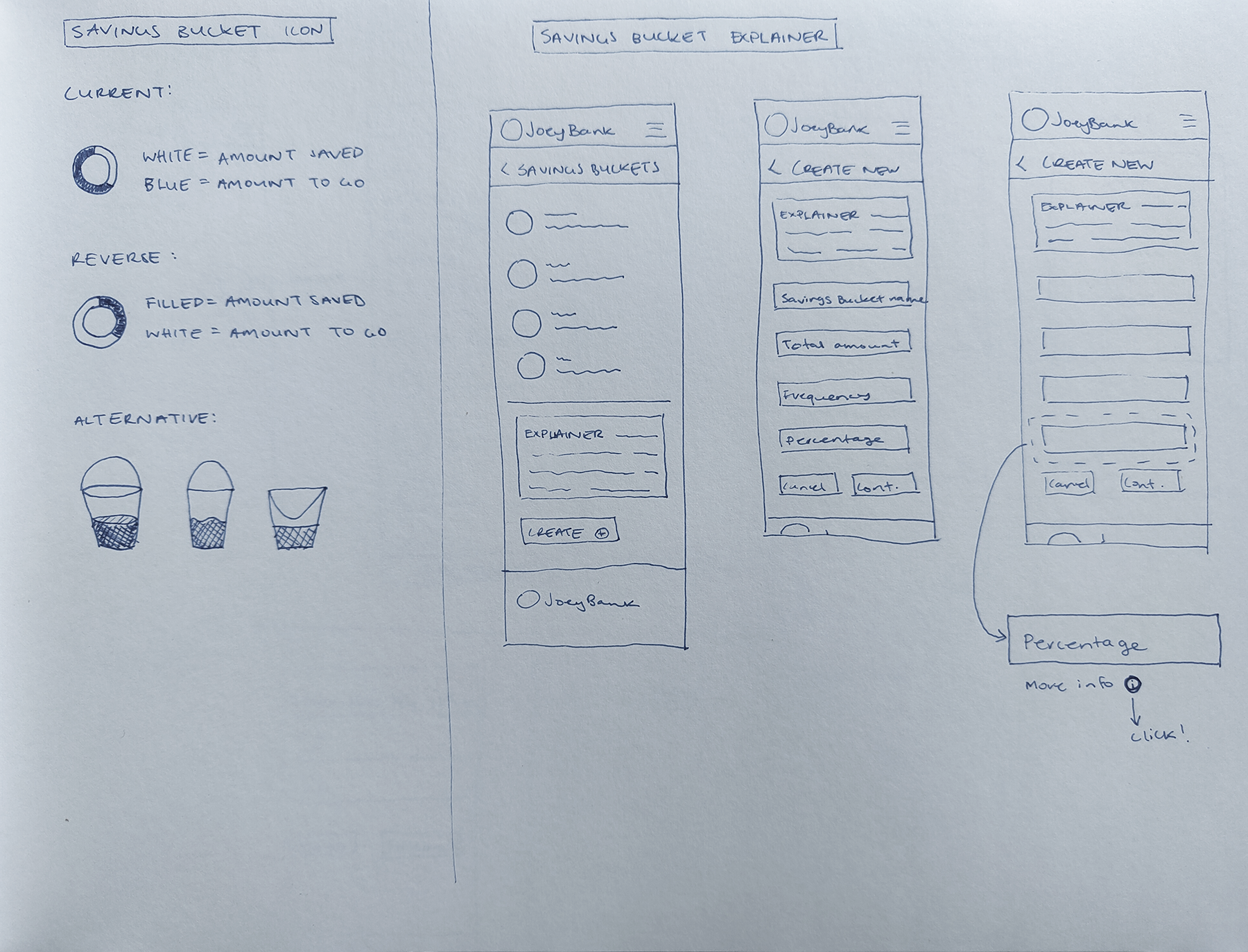
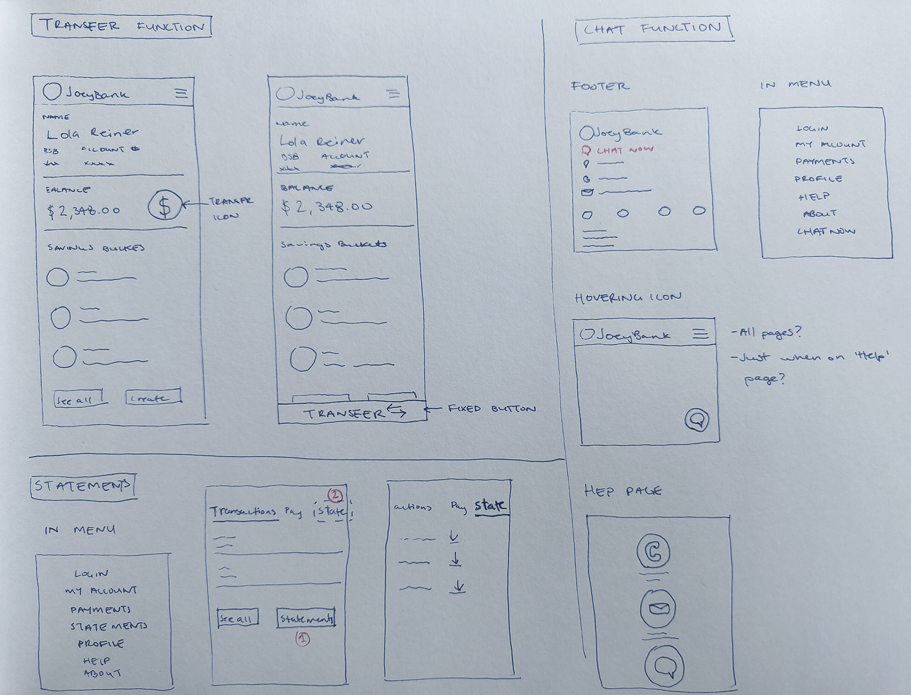
I took the medium-fidelity prototype into usability testing. I took the information from the users and sorted it using the Rose, Bud, Thorn method to group into insights. The insights resulted in some new elements being introduced, some elements design being updated, and some pages being re-organised. I sketched up these new and updated elements before heading into the high-fidelity prototype.
Hi-fidelity Prototype
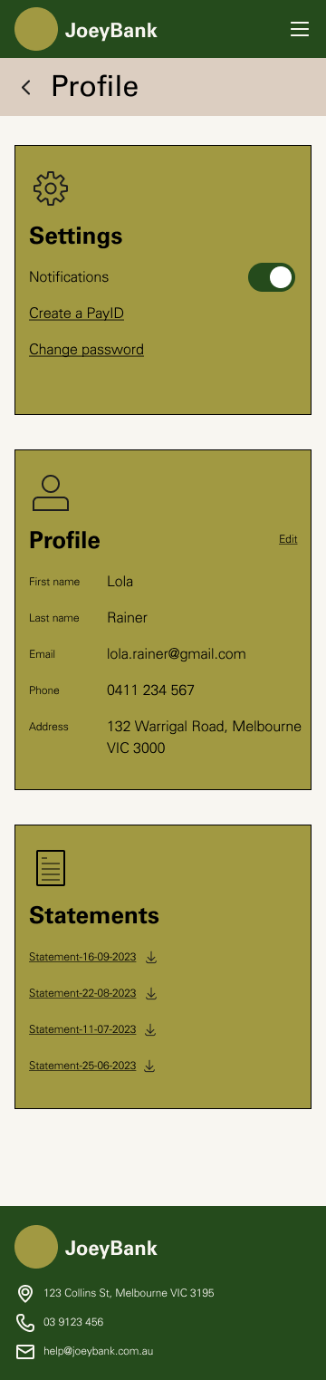
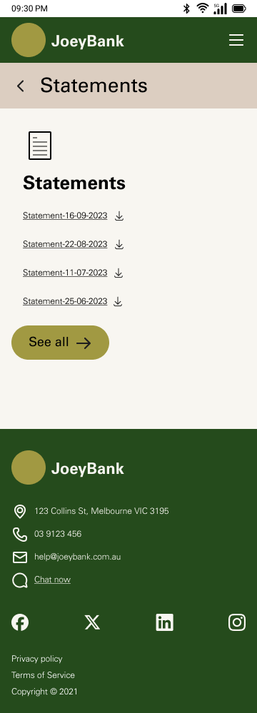
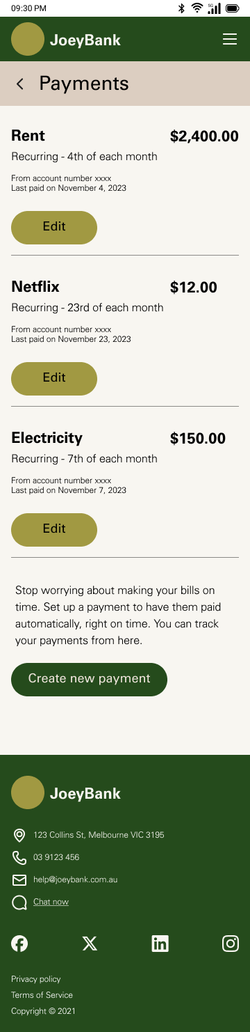
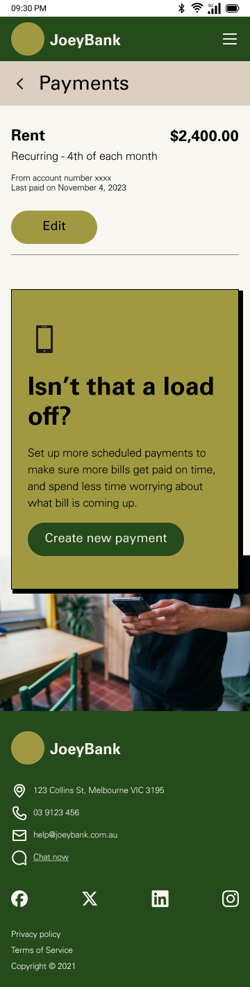
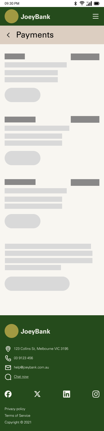
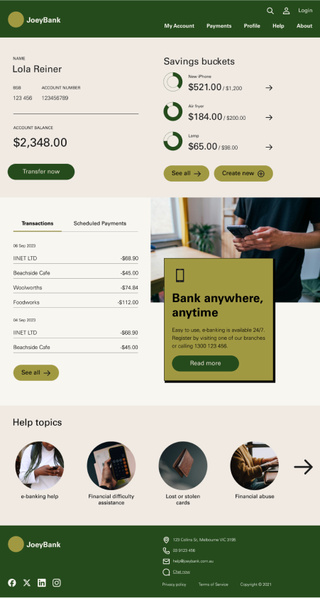
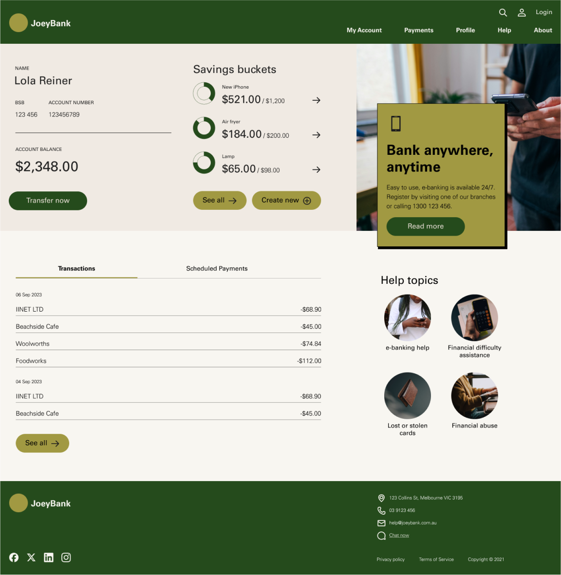
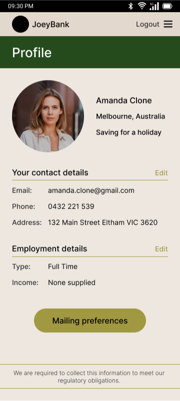
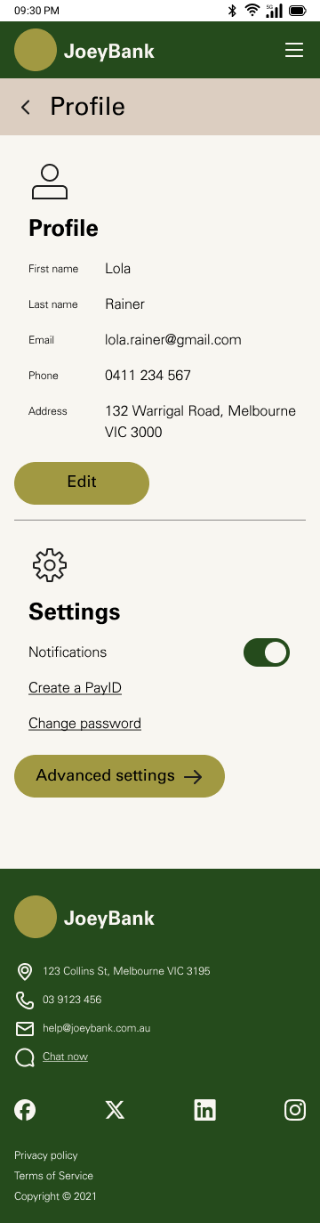
The high-fidelity prototype includes all the pages for the minimum viable product release in their ideal state, as well as examples of the error, loading, blank and partial states for one of the pages. The account landing page is also shown in tablet and desktop, showing how the components are reused and resized to suit.
UI Weekly Design Challenges
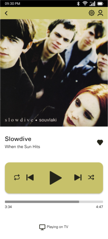
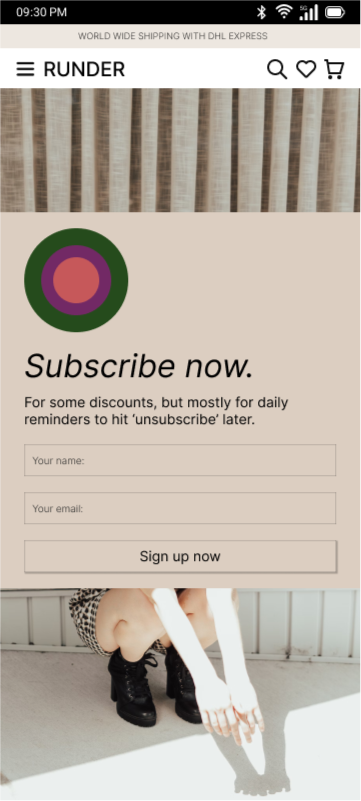
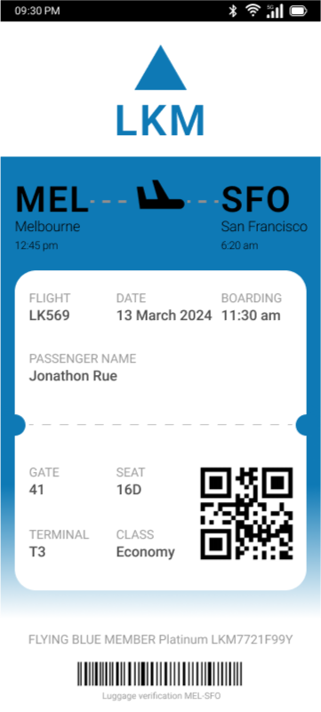
A collection of weekly UI design challenges I have completed. Each was done in 30 minutes or less.
Contact
emaillinkedininstagram